
Click on image to view larger
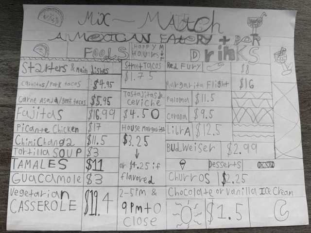
Menu Design Project – Rough Sketches
The Menu Design Rough Sketch Project is an early-stage design exercise where I explore different layout ideas for a restaurant menu before moving into full digital production. I start by sketching out several rough concepts on paper—playing with hierarchy, spacing, section organization, typography ideas, and how the eye should travel across the page. These rough sketches let me experiment quickly without worrying about perfect measurements, and they help me focus on the overall structure and mood of the menu.
The project became especially effective once I transferred my sketches into Adobe InDesign because the software allows me to refine those ideas with professional precision. InDesign makes it easy to turn loose sketches into polished layouts by giving me full control over grids, margins, typography, and alignment. Tools like paragraph styles, character styles, and the Frame tools let me create clean sections for appetizers, entrées, desserts, and drinks while keeping everything consistent. I can experiment with multiple layout variations, adjust spacing, and test color palettes more efficiently than on paper. By combining my hand-drawn sketches with InDesign’s powerful tools, the project evolves from a rough visual idea into a polished, print-ready menu design.
Click on image to view larger
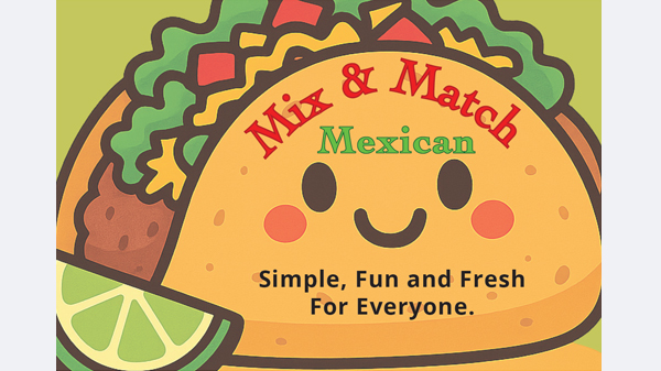
Menu Design Project – Final Composition
The Menu Design Final Composition Project is the stage where my early sketches and layout ideas come together into a fully realized, professionally designed menu. After experimenting with rough concepts on paper, the final composition focuses on clarity, hierarchy, typography, and branding to create a menu that is both visually appealing and easy for customers to navigate. This phase is all about refining the layout, choosing consistent typefaces, balancing white space, organizing sections, and applying a cohesive color palette that reflects the restaurant’s identity.
The project became especially effective in Adobe InDesign because the software gives me precision and control over every design element. InDesign’s grid systems, paragraph styles, and alignment tools allow me to fine-tune spacing and create clean, readable sections for appetizers, entrées, drinks, and desserts. I can test typography combinations, adjust photo placement, add icons or decorative elements, and ensure everything lines up perfectly. The ability to manage multiple pages, create master styles, and export high-quality print files makes InDesign the ideal platform for turning my sketches into a polished, professional menu.
Combining my creative planning with InDesign’s powerful layout tools helped me transform a rough concept into a cohesive and visually engaging final composition that feels ready for real-world use.
Click on image to view larger
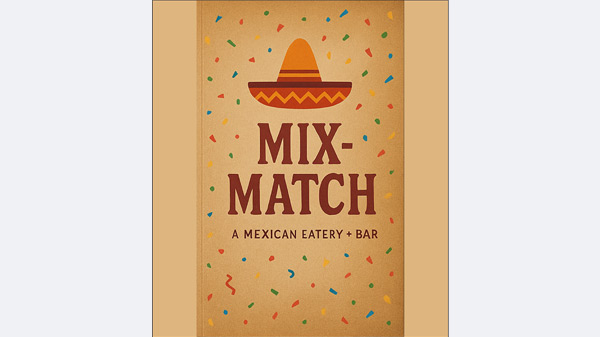
Product Catalog
The Product Catalog Project is a design assignment where I organize a collection of products into a clear, visually structured catalog that highlights each item’s features, images, and pricing. The goal is to create a layout that is easy for customers to browse while still reflecting a consistent brand style. This project helped me practice visual hierarchy, grid systems, typography, and image placement—all essential skills for real-world commercial design. I learned how to balance information and visuals so every product feels intentional and easy to understand at a glance.
The project became especially effective in Adobe InDesign because the software is built for multi-page layouts and structured content. InDesign allowed me to set up master pages, create consistent paragraph and character styles, and place product images with precision. I could duplicate page templates, keep spacing uniform, and quickly adjust elements across the entire catalog. Tools like text threading and column control made it easier to manage long descriptions or multiple product categories. By using InDesign’s powerful layout features, I was able to transform a simple list of products into a professional, polished catalog that looks ready for print or digital distribution.
Click on image to view larger
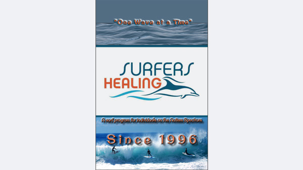
Newsletter
The Newsletter Project is a communication and layout assignment where I design a multi-page publication that delivers information in a clear, organized, and visually engaging way. The goal is to combine text, images, graphics, and page structure so that the newsletter feels professional, easy to follow, and aligned with a consistent theme or brand. Through this project, I learned how to work with hierarchy, spacing, captions, columns, and section organization to guide the reader’s eye from one piece of content to the next. It taught me how to think like an editorial designer—balancing storytelling with strong visual layout decisions.
The project became especially effective once I built it in Adobe InDesign, because the software allowed me to apply structure and consistency across every page. InDesign’s grid systems, master pages, paragraph styles, and frame tools helped me keep headings, body text, photos, and icons aligned and uniform. I could easily create multi-column layouts, manage spacing, add pull quotes, and ensure that every element followed the same visual rules. The ability to duplicate spreads, adjust formatting globally, and export print-quality files made the workflow much smoother and more professional. InDesign transformed my initial ideas into a polished newsletter that looks ready for real distribution.

Click on image to view larger
Final Project – City-Beat Magazine
The City-Beat Magazine Project is a comprehensive editorial design assignment where I create a full magazine centered around a specific city or community. The goal is to design everything—from the cover and table of contents to feature articles, guides, ads, and local highlights—using a cohesive visual style that reflects the character of the place I’m showcasing. This project taught me how to think like a real magazine designer, working with page flow, typography, imagery, hierarchy, and storytelling to build a publication that feels professional and engaging from start to finish.
The project became extremely effective on Adobe InDesign because the software is built for long-form, multi-page editorial layouts. InDesign allowed me to structure the magazine using grids, columns, and master pages, ensuring consistency across every spread. I was able to create clean typographic styles, organize large amounts of content, design advertisements, and arrange photos with precise alignment and spacing. Tools like paragraph styles, character styles, text threading, and the ability to duplicate or reorganize pages made the entire process far more efficient. Thanks to InDesign, I could bring together all the visual and written elements into a polished, unified magazine that feels ready for publication.
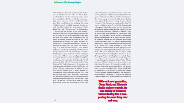
Click on image to view larger
Layout Re-Creation Project
The Layout Re-Creation Project is a hands-on design assignment where I study an existing magazine layout and rebuild it from the ground up inside Adobe InDesign. Instead of simply copying the design, the goal is to understand why the original layout works—its grid structure, hierarchy, spacing, typography, and overall visual flow. By breaking the design apart and rebuilding it myself, I learn how professional magazines use balance, contrast, alignment, and consistency to communicate clearly.
This project became very effective in Adobe InDesign because the software is built specifically for editorial design. InDesign gives me precise control over grids, margins, typography, and image placement, allowing me to replicate professional layouts with accuracy. Tools like master pages, paragraph styles, character styles, and the Frame/Text tools make it easier to recreate an existing design while developing my own design instincts at the same time. The process teaches me how to think like a layout designer—not just placing elements, but understanding the purpose behind each design choice.